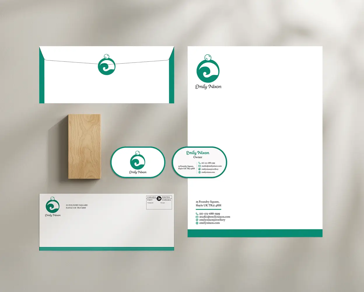
Emily Nixon’s existing branding lacked a cohesive visual identity that truly reflected the artisanal quality, coastal inspiration, and playful sophistication of the jewellery. The old logo did not capture the brand’s uniqueness or charm. Looking at it, you could not tell what the brand was about. This created a barrier for potential customers, making it hard for them to connect with the jewellery or the story behind it. The project required a well-rounded approach to create a visual identity that felt authentic, engaging, and memorable.
Research: Mood boards, inspiration, analysis, and background research.The process began with a mind map to explore the brand and its influences. I then conducted competitor research to understand the artisan jewellery landscape and uncover ways for Emily Nixon to stand out. Finally, mood boards were created using coastal imagery, natural textures, and colour palettes that reflected the brand’s handcrafted quality and Cornish roots.
Ideation: Sketches, brainstorming, wireframes, and concept development.After completing the research, I began sketching various logo concepts, experimenting with elements inspired by the ocean and organic forms. The strongest concepts were brought into Illustrator, where they went through multiple rounds of peer feedback before arriving at the final logo. As well, I began to sketch some layout ideas for the branding guide.
The final outcome was a refreshed visual identity that captures Emily Nixon’s coastal charm and artisanal spirit. The new logo, featuring a ring, pearl, and wave, reflects the brand’s connection to nature while maintaining a sense of elegance and simplicity. A soft blue palette and refined typography tie everything together, creating a warm and recognizable look. To ensure consistency, I developed a clear branding guide covering logo usage, colours, typography, photography, and digital presence. The redesigned website built on this foundation with clean layouts and inviting imagery that highlight the jewellery and share the brand’s story in a more engaging way. Together, these updates created a unified, authentic identity that helps customers instantly connect with who Emily Nixon is and what she represents.
For the branding guide, I worked in stages starting with the logo itself, including artwork, colours, typefaces, and more. Next, I moved on to general brand elements such as backgrounds & contrast, graphic treatments, and photography. Finally, I focused on digital presence (website), social media applications, and mockups to ensure the brand translated seamlessly across all platforms.