The skincare market is saturated with products and information, leaving users overwhelmed and unsure of what actually works for them. Many existing apps focus on general ingredient analysis but overlook personal factors like allergies, skin type, or sensitivities. The challenge was to design an experience that gives users a personalized, educational, and confidence-boosting way to find products that fit their skin perfectly.
Research: Mood boards, inspiration, analysis, and background research.
The project began with an in-depth look at competitor apps to see what was missing. I focused on usability, personalization features, and overall clarity. While most apps offered ingredient breakdowns and safety scores, few provided truly personalized guidance based on skin type, sensitivities, and allergies.
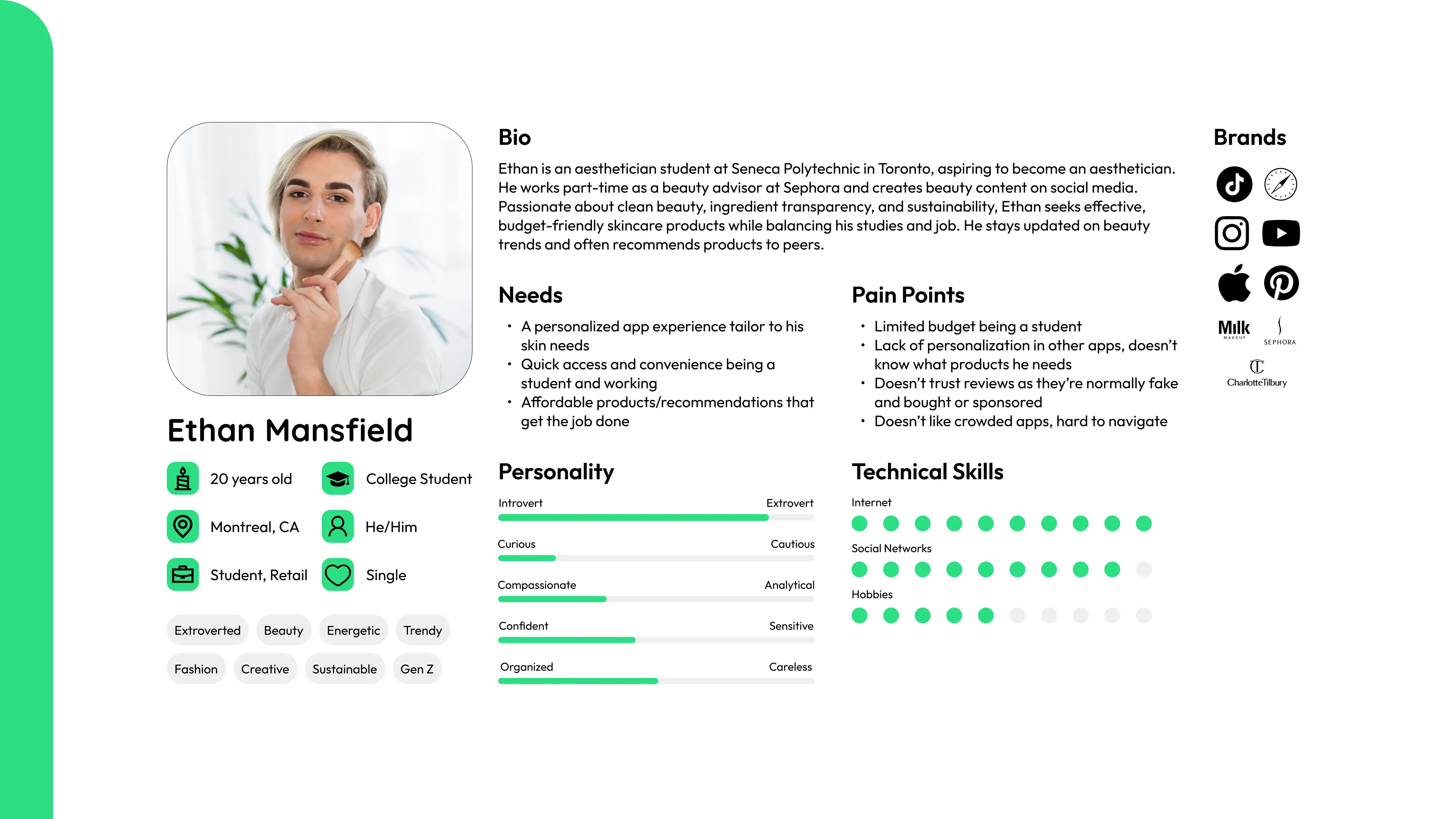
From there, I started doing my target market research to understand who would benefit most from Radiant Aura. This helped me identify two primary audiences. Gen Z users who are skincare-obsessed and value transparency, and millennials looking to maintain healthy, youthful skin through trusted recommendations. Both groups needed something more tailored than what was out there.
Next, I created detailed user personas for these audiences’ that outlined their needs, frustrations, and motivations. These profiles helped guide my design decisions and kept me on track with the project goal. Finally, I built a moodboard that set the tone for Radiant Aura’s visual direction. The palette leaned toward calming greens, neutrals, and easily identifiable colours evoking freshness, balance, and trust.
Ideation: Sketches, brainstorming, wireframes, and concept development.
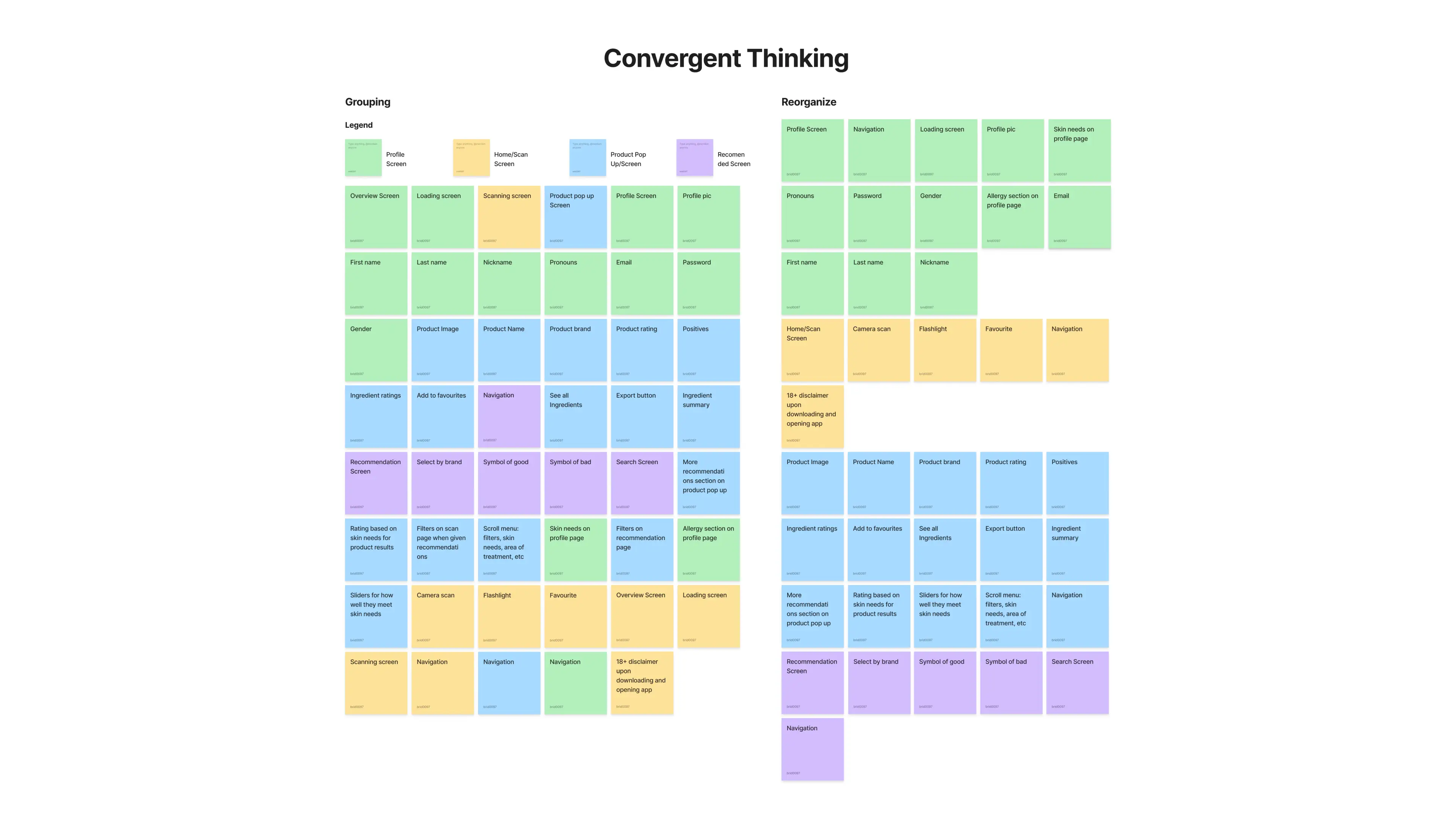
I started with sticky note brainstorming, mapping out common features found across different skincare apps. From there, I grouped and compared them, then used a process of elimination to isolate what truly mattered to Radiant Aura’s users. This helped me define not only the core features to keep but also the new features that would make the app stand out.
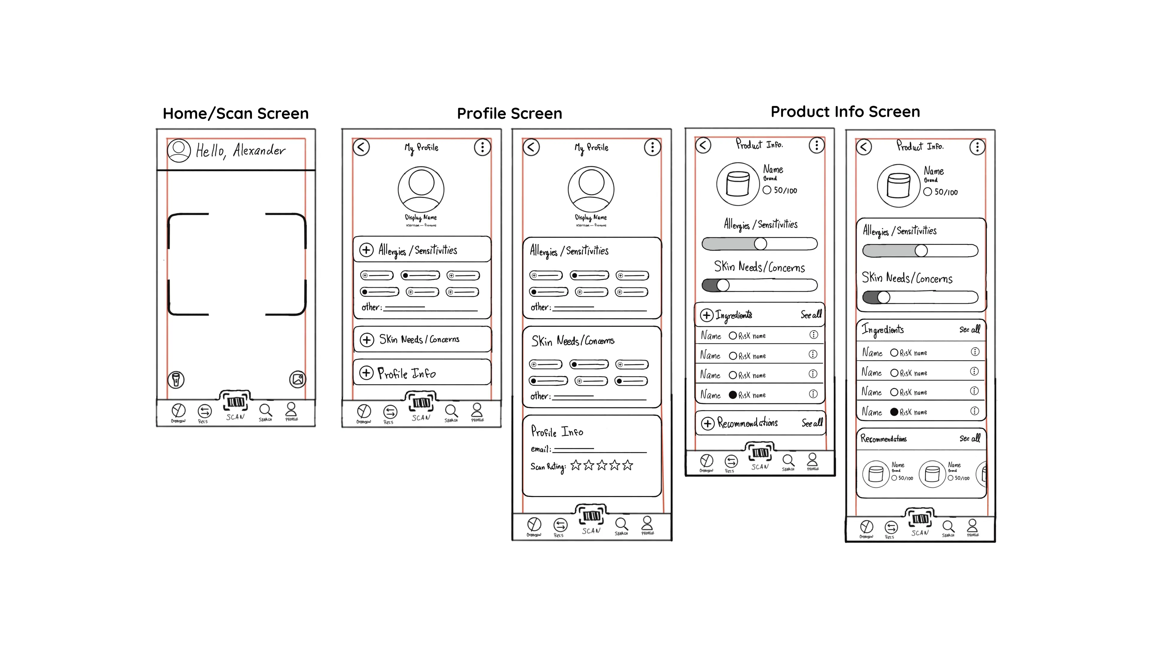
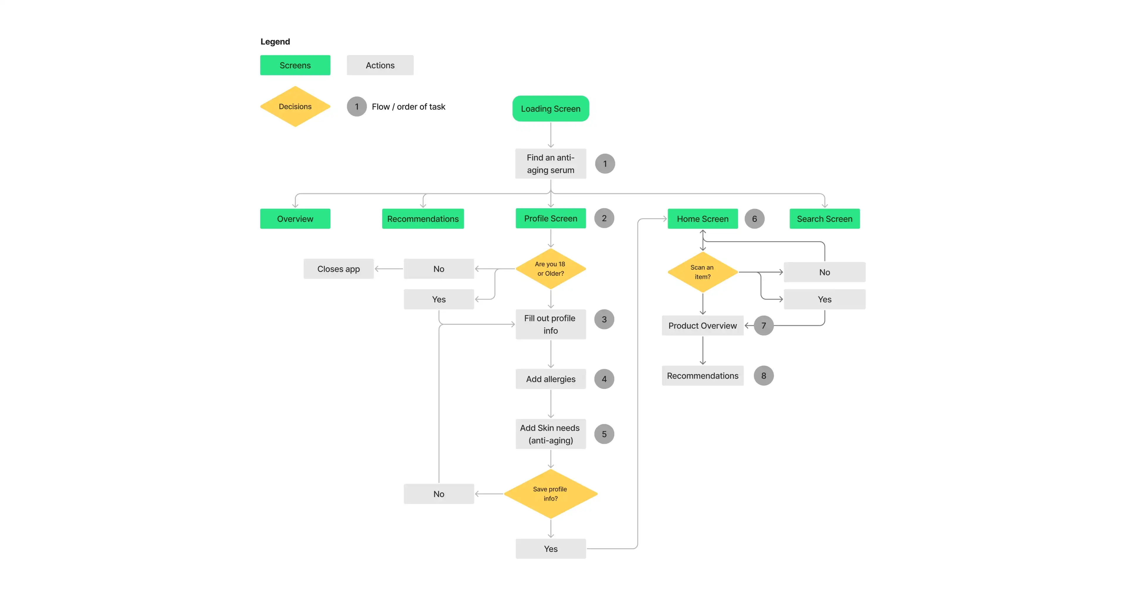
From there, I began sketching the structure and layout of the main screens, exploring different ways users could navigate their profiles, scan products, and view recommendations. I created both low-fidelity and high-fidelity sketches to refine the flow and visual consistency of the app.
I then shared these concepts in a focus group to gather feedback. Overall, the layouts felt intentional, cohesive, and simple to navigate, giving the app a strong sense of unity. One standout insight was that participants preferred Option Two for the loading screen, as it matched the app’s overall style and the addition of a progress bar made the experience feel more engaging and fluid.
In Figma, I brought Radiant Aura to life through high-fidelity wireframes and prototyping. I focused on a minimal look with pops of green to create a sense of freshness and trust. Every detail was refined to keep the app informative yet approachable, making even complex ingredient information easy to understand.