Wherring’s original app experience lacked flexibility and clarity, making it difficult for users to build outfits in a way that felt natural. Key styling elements like layering and accessories were missing, limiting customization and breaking the flow of outfit creation. The challenge was to redesign the experience to better reflect how people actually get dressed, while improving usability and navigation.
Research: Mood boards, inspiration, analysis, and background research.
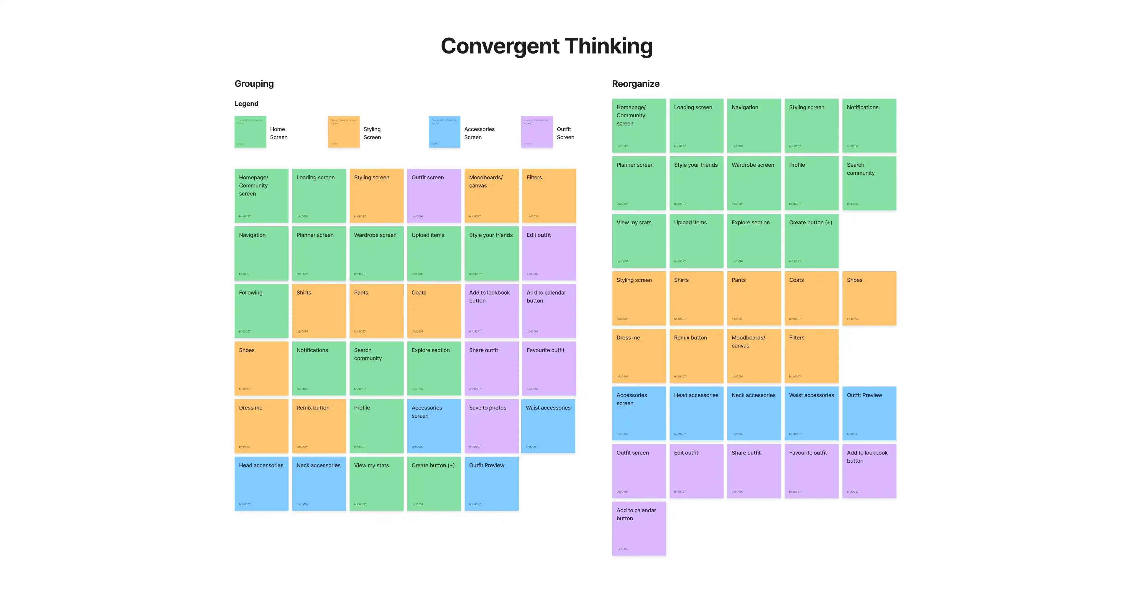
The process began with a close review of the existing Whering app to identify usability and customization gaps. I focused on how users built outfits and where the experience felt restrictive or unclear, particularly around layering, accessories, and navigation. This highlighted a disconnect between the app’s functionality and how people naturally style outfits in real life.
Ideation: Sketches, brainstorming, wireframes, and concept development.
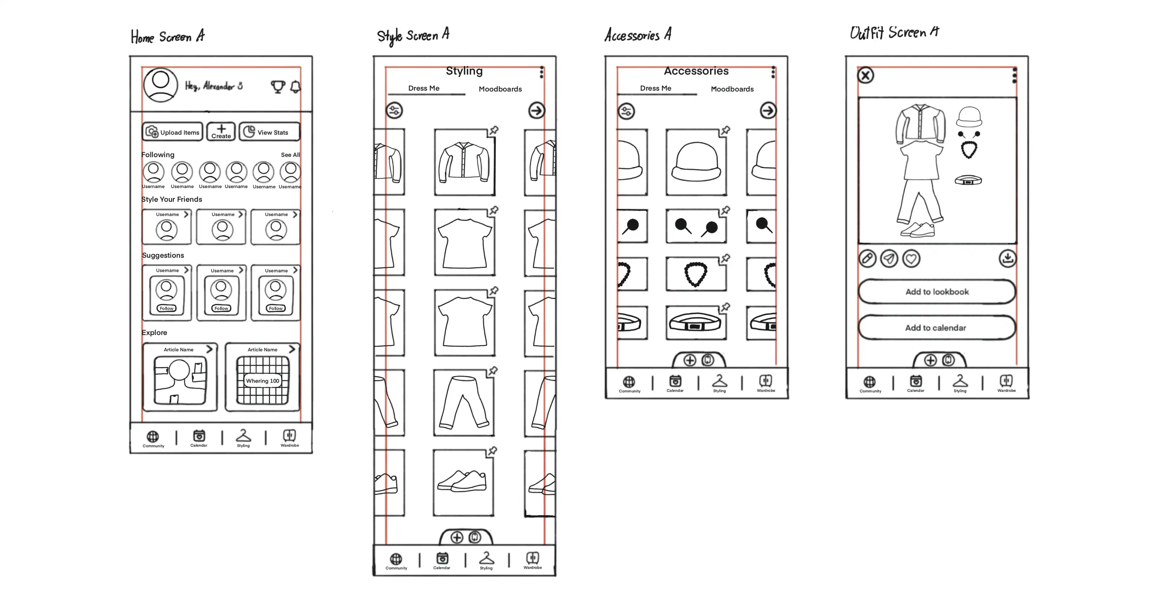
Using these insights, I moved into ideation by exploring ways to restructure the outfit-building flow. I sketched and mapped out layouts that introduced layering options and a dedicated accessories screen, allowing users to create more complete looks. Early wireframes focused on improving clarity, reducing friction, and ensuring the experience felt intuitive, cohesive, and aligned with real-world styling behaviour.

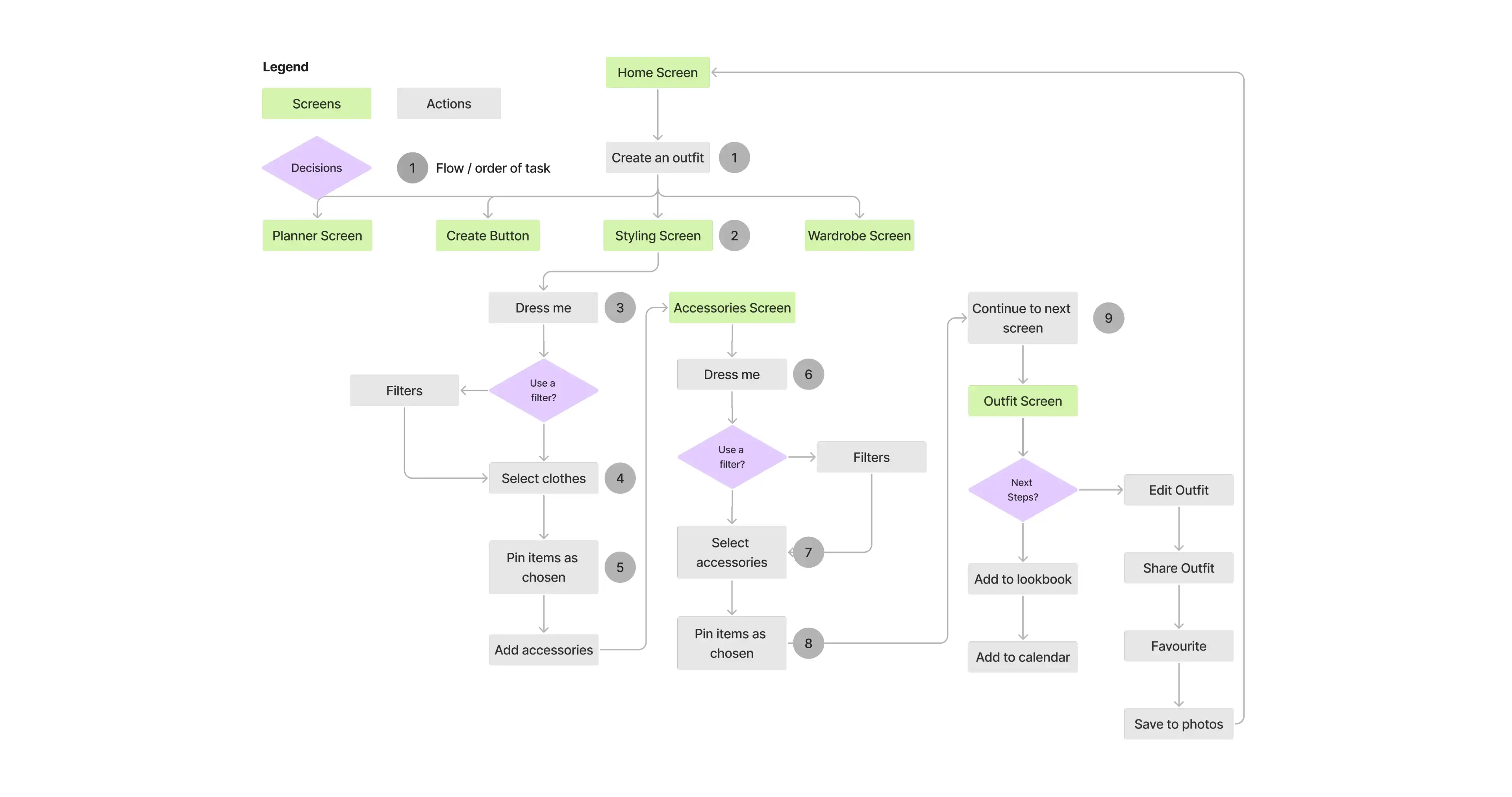
In Figma, I brought Whering to life through high-fidelity wireframes and prototyping. I focused on improving hierarchy, spacing, and screen transitions to create a smoother and more intuitive outfit-building flow. Prototyping allowed me to test realistic styling actions, such as layering pieces and adding accessories, ensuring the experience felt flexible, cohesive, and aligned with how users actually get dressed.